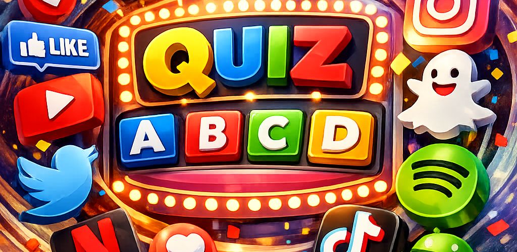

Hey there logo lovers! Ready to dive into some 2010s logo trivia? Let’s take a trip down memory lane and revisit the iconic logos that defined the last decade. From sleek redesigns to bold rebrands, the 2010s were full of memorable logo moments that shaped the world of branding. So grab your favorite snack and get ready to test your logo knowledge!
1. Instagram – Remember when Instagram ditched the retro camera for a more modern and colorful look in 2016? The new logo divided many users, but it’s now hard to imagine the platform without it.
2. Airbnb – In 2014, Airbnb unveiled its new logo, which symbolizes belonging and the idea of a global community coming together. The simple yet impactful design resonated with users around the world.
3. Google – Google underwent a major rebranding in 2015, introducing a more playful and vibrant logo that reflects the company’s innovative spirit. The new font and bright colors gave Google a fresh and modern look.
4. Uber – Uber’s logo evolution in the 2010s was a rollercoaster ride, with multiple redesigns and tweaks. The final result in 2018 was a sleek and sophisticated new logo that signifies movement and connectivity.
5. Spotify – In 2015, Spotify updated its logo with a cleaner and more streamlined design. The new logo retained the iconic green color and sound waves, while also bringing a more polished and modern aesthetic.
So there you have it, a quick trip through the 2010s logo landscape. Which logo change was your favorite? Let us know in the comments below! And stay tuned for more logo trivia as we continue our journey through the decades.
#LogoLove #2010s #Branding #Design #TriviaTime
Summary “ART Guides @Sedehoo”:
– Fun trivia journey through iconic logos of the 2010s
– From Instagram to Google, explore the evolution of popular brands
– Share your favorite logo change in the comments!